[ad_1]
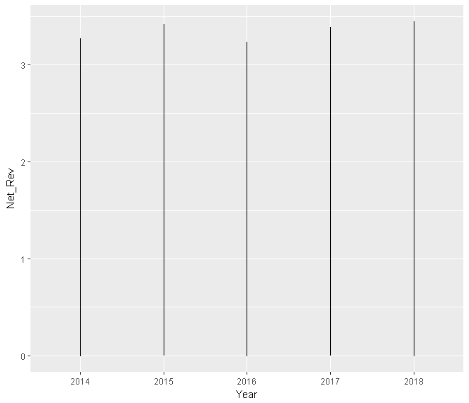
1) The issue is that sales_clean$Year is a factor.
2) ggplot interprit your x-value as categorical, y-value as continous and aggregated value into the bar plot (instead bar there are lines).
Please see the simulation:
library(ggplot2)
set.seed(123)
sales_clean <- data.frame(Year = rep(factor(2014:2018), 1000), Net_Rev = abs(rnorm(5000)))
plotLine <- ggplot(sales_clean, aes(Year, Net_Rev, na.rm = FALSE))
plotLine + geom_line()
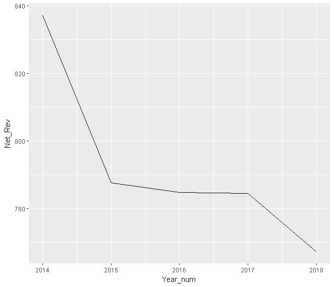
3) One of the solutions is to convert factor into the numeric and aggregate by Year.
Please see the result:
sales_clean$Year_num <- as.numeric(as.character(sales_clean$Year))
sales_clean_plot <- aggregate(Net_Rev ~ Year_num, sales_clean, sum)

plotLine <- ggplot(sales_clean_plot, aes(Year_num, Net_Rev, na.rm = FALSE))
plotLine + geom_line()
4) It is better not to use $ in ggplot‘s aes(), as the data.frame name is already mentioned in the first argument of ggplot(). The code become crumpy and difficult to read.
[ad_2]
solved Line chart with categorical values in ggplot2?